Esther: For such a time as this

Tonight and tomorrow is Purim, the holiday celebrating the deliverance of the Jews of Persia from the evil machinations of the King’s vizier. There are four central mitzvot (commandments) of this holiday, but the most iconic one is the reading of the book of Esther, known as the Megillah (Scroll).

Megillat Esther has a special trope (melody) that I’ve never learned, but this year, we’re all reading out of books at home via Zoom, and our rabbi asked me if I would take on reading chapter 4. This chapter, as it happens, has several verses that are read in the the trope used for the book of Eicha (Lamentations) on Tisha B’Av, which I learned a couple years ago, so I figured that was a sign that I should step up.

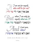
This chapter also includes a verse that has always resonated with me. Queen Esther (in the palace) and her uncle Mordechai (protesting out in the town square) exchange a series of messages via Hatach, the chamberlain, about the looming crisis for the Jews. Mordechai implores Esther to use her privileged status and access to the king to intervene for her people, saying, “Do not think that because you are in the king’s house you alone of all the Jews will escape. For if you remain silent at this time, relief and deliverance for the Jews will arise from another place, but you and your father’s family will perish. And who knows but that you have come to power for such a time as this?” (Esther 4:13-14)

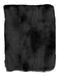
For this image, I wanted a watercolor wash background, and since it was surprisingly hard to find a suitable free version, I created my own in Photoshop. Drop me an email or a comment if you want a pointer to the exact brush settings. Then I darkened it up to improve the contrast.

I saved my images as grayscale TIFFs so I could apply the magenta color to them in InDesign, but WordPress is making me post them here as JPEGs. Do with them what you will – these backgrounds are free for personal or commercial use – but please find a way to link back to schultzyakovetz.com if you want to maintain good Internet karma.

The script font I chose is Selima, a lovely free brush script created by Jroh Creative. The block face is classic Goudy Old Style and the Hebrew is the beautiful Escritura Hebrew Demibold by Ricardo Santos.

May we all use our power and privilege to do good anytime we find ourselves in a position to do so. Who knows but that we were placed there for just such a time?

Now, off to finish cramming that reading! Purim sameach!

Tzedek, tzedek tirdof: The pursuit of justice

When I receive a request for a custom design piece, it is often a Bible verse or other Jewish text that would make a good addition to my overall portfolio. In those cases, I add a custom design charge of $20 to the regular art pricing, which entitles the client to choose their design direction and request a complimentary round of revisions (I usually throw in a second and even a third round for free). However, the alternate drafts along the way usually result in work that I can make available for general sale.

Back in July, I had a recent Etsy customer come back to me and say “Would you consider making something for Deuteronomy 16:20, ‘Justice, justice you shall pursue’?” Of course, that verse has been on my list of ideas for a long time, so I jumped at the opportunity to work something up.

For the first pass, I wanted to evoke the feel of a protest poster. I paired Flood, a brush font with a hand-drawn feel, with the Hebrew typeface Shuneet by Michael Cunliffe Thompson. The rainbow palette as well as the black and brown lettering for “justice” play up the theme of diversity.

I wanted to create the second version as a round layout, since my client wanted it to coordinate with a previous print. This setting uses the typefaces Minion (serif), Bilbo (script), and SBL Hebrew (from the Society for Biblical Literature) for a more traditional feel. Special thanks are due to the Open Siddur Project for connecting me with the Hebrew fonts.

I made this layout available in both a rainbow and a black-and-white (grayscale) color palette. A package with all three versions is also available in my Etsy shop as a printable PDF download.

It happens that this verse from Deuteronomy falls in Parshat Shoftim, which is tomorrow’s Torah portion. Today is also Rosh Chodesh Elul, the first of the month of introspection leading up to the High Holy Days, and the theme of justice/righteousness is strongly resonant at this season, especially the idea that the pursuit of justice is life-promoting.

Wishing you all a meaningful season of spiritual preparation. We have work to do, people.


The best CMYK match for Cadmium Orange

Spoiler: There isn’t one. But read on to understand why.

Perfect for Halloween: a post about orange!

I had a request earlier in October from an Etsy customer in Brooklyn who wanted a custom print created of the phrase בשבילי נברא העולם (“The world was created for me“), with “for me” in orange “to match Moully’s ‘Orange Socks’.”

*Note: she didn’t ask me for ואנכי עפר ואפר but now I feel perhaps I should create this as a two-sided laminated pocket card. :-)

I wasn’t familiar with Moully, but Rav Google quickly brought me to Yitzchok Moully, the Pop Art Rabbi, and his popular little painting [Hasidim in] Orange Socks.

"Hasid in Orange Socks" by Yitzchok Moully.

“Hassid in Orange Socks” by Yitzchok Moully.

I saved down an image of the painting from his website, sampled the orange color directly from it, designed a layout of the text, and sent a proof to my customer. She approved it, so I output a color laser print and shipped it off to Brooklyn. Easy-peasy. Right?

On Tuesday, I got another message: She was unhappy. Why? Because the printed version was a “burnt orange” rather than the “true orange” she had approved onscreen.

While it hadn’t occurred to me ahead of time that this would be an issue, I should have known better. Bright orange (along with bright green) is notoriously difficult to produce in a CMYK 4-color system, such as commercial process printing—or a conventional laser printer.

In fact, industry leader Pantone developed an entirely new 6-color printing system called Hexachrome that addressed this problem by adding actual orange and green inks to the standard process palette of cyan, magenta, yellow and black. One year at the Bookbuilders of Boston book show, I saw a book on tree frogs printed in Hexachrome, and it was utterly stunning, so much so that it’s still fresh in my mind. You couldn’t invent a better use case to showcase the capabilities of Hexachrome (which, sadly, was discontinued in 2008, no doubt due to a dearth of scholarship on tree frogs).

But all this wasn’t helping my Brooklyn customer, who just wants a print that will match what she sees onscreen. It sounds like a simple request!

I was not at all sure how to overcome this discrepancy remotely, so the solution I offered was to work up a few variations with alternate shades and send her prints of all of them. As I got started, however, I thought: Why not go to the source? Maybe the artist has already dealt with this issue and could make a suggestion? So I returned to Rabbi Moully’s website and submitted a contact form inquiry, explaining my situation, and asking if he could recommend the best settings for a CMYK match.

Not 5 minutes later, my phone rang with an unknown New Jersey number, and it was Yitzchok Moully calling from his cell, stuck in traffic while driving the carpool. “I figured I might as well call!”

He let me know that the original painting used straight Cadmium Orange, which is pretty classic… and thoroughly unreproducible in 4-color process printing. However, there are several possible spot-to-process conversions cited as a “true orange”. So, starting with the first shade my customer had rejected, and lightening up from there, I ended up with 8 possibilities.

These are the 8 shades I sent her:

#1: RGB 230-75-9
This was my original offering, but when I printed it off, I could definitely see why the customer thought it was too red.

#2: RGB 253-84-5
This is a second shade I sampled from Moully’s JPEG image. It looks good onscreen, but still looks dark when printed in CMYK. (The CMYK conversion is done on the fly by the printer driver, so I don’t know the exact conversion values.)

#3: C0 M75 Y99 K0

#4: C0 M62 Y97 K0
This was the one I liked when printed, and what I’ve chosen to use going forward. Approximate hex color match is #FF6108 (255,97,8).

#5: C0 M43 Y81 K7

#6: C0 M51 Y100 K0
To my surprise, this was the one my client picked as her preferred match. It’s a shade that I had found published as an equivalent of Pantone 152 (although Pantone officially recommends C0 M61 Y100 K0, which has 20% more red [that is, magenta] in it).

#7: C0 M48 Y95 K0
A possible equivalent of Pantone 151.

#8: C0 M35 Y90 K0
A possible equivalent of Pantone 137. Obviously this is the most yellow (or rather, least magenta) of the selections.

Moral of the story: It all depends what you think a “true orange” really is! … And also on your screen vs. printer calibrations, but that’s a topic for another day.

New art piece: If I Am Not For Myself, Who Will Be For Me? (2015 Edition)

I’m pleased to report that my Etsy shop, Schultz Yakovetz Judaica, is doing well. Not “quit my day job” well or anything, but I’ve literally sold more art in the last six months than I had in all the previous years—total—of selling via my website. (For that matter, it seems to have raised the profile of my own site, since a few of those recent sales came directly through my site rather than the Etsy shop. And even that was a statistically significant uptick.)

ifiam_originalMost recently, I happened to see a few orders in a row for one of my earliest pieces, a setting of Rabbi Hillel’s famous aphorism in Pirkei Avot:

If I am not for myself, who will be for me?
But when I am only for myself, what am I?
And if not now, when?
(Pirkei Avot 1:14)

Fun fact: I first created this piece in a handmade version as a gift for my dad back in 1994. The typeset version was designed some years afterward, but no later than 2001.

In other words, it’s gotten a little dated… especially as typographic decorative art has really come into fashion over the last few years (everywhere from Etsy to CB2 to Target) with a more contemporary aesthetic.

Looking at it with fresh eyes, I decided that it was really time for an update. So I created a new version.

This slideshow requires JavaScript.

While I was at it, I posted a downloadable version so that buyers can print their own copy (at any desired size) locally, rather than have me ship them an unframed print. One download includes PDFs of all three pieces.

Carpe diem!

Poppin: Gorgeous office supplies for color nerds

I first saw it in a Facebook ad. I try to avoid EVER clicking Facebook’s sidebar ads, but the picture in this one was so appealing, I couldn’t resist: a spotless white office desk tricked out with a whole suite of beautiful, brightly colored, matching office supplies.

This was my introduction to Poppin, whose mission statement begins, “Poppin believes you should be able to surround yourself with objects of beauty everywhere you go and in everything that you do.” Founded in 2009 by NYC entrepreneurs with a background in fashion (explains the killer aesthetics, right?), the company was publicly launched in September 2012, but it’s only more recently that their impressive PR is really gaining traction.

The sheer glossy perfection of it was what got me. I was in awe. Not just visually, but technically: How do you even achieve that kind of color matching across a dozen different materials and manufacturers? (It turns out that this was, indeed, a nontrivial issue for them.) I emailed the Shop By Color link straightaway to my BFF (an avowed devotee of all things purple). I followed Poppin on Pinterest. And then on Twitter. I was hooked.

But it wasn’t enough for me to lovingly browse the color selections. I had to know: What were the specs for the 16 colors?? With a few minutes of poking around their website style sheets, I managed to uncover the official hex/RGB codes. But even more specifically, I wanted to know if they had officially designated corresponding swatches in the industry-standard Pantone Matching System, or PMS. Read more about Pantone here.

I couldn’t find any mention of Pantone in their FAQ, but luckily, Poppin also encourages you to email questions to their “Work Stylist” team. So I did. Not 45 minutes later, team member Shannon sent me a perky response email with an attached PDF document — an array of the 16 swatches with their PMS numbers. My respect for the company ratcheted up several more notches.

I asked her if I could share the breakdown, and she said “feel free to spread the info!”, so here it is:

Name Hex RGB Pantone
White  #ffffff  R: 255 G: 255 B: 255 n/a*
Yellow  #ffd200  R: 255 G: 210 B: 0 PMS 116C
Orange  #f47b20  R: 244 G: 123 B: 32 PMS 166C
Coral  #ff6666  R: 255 G: 102 B: 102 PMS 178C
Red  #d31245  R: 211 G: 18 B: 69 PMS 200C
Pink  #eb4498  R: 235 G: 68 B: 152 PMS 219C
Lime Green  #c1d82f  R: 193 G: 216 B: 47 PMS 382C
Mint  #abd2aa  R: 171 G: 210 B: 170 PMS 2254C
Aqua  #68c8c6  R: 104 G: 200 B: 198 PMS 325C
Pool Blue  #00a5d9  R: 0 G: 165 B: 217 PMS 639C
Navy  #00457c  R: 0 G: 69 B: 124 PMS 295C
Purple  #52247f  R: 82 G: 36 B: 127 PMS 2617C
Light Gray  #c5c6c8  R: 197 G: 198 B: 200 PMS 421C
Silver  n/a**   PMS 877C
Gold  n/a**   PMS 871C
Black  #000000  R: 0 G: 0 B: 0 PMS Black 6C

*Pantone does actually offer a selection of white shades, but Poppin didn’t spec one. :-)
** These metallics are represented on their website with background GIFs instead of solid CSS color blocks.

For now, the CMYK equivalents (for use in four-color process printing, including your home or office laser printer) are left as an exercise to the reader. (Pro tip: InDesign will give you a reasonable conversion right in your Swatches library if you create a swatch of your target PMS color, then convert to CMYK. This will give you a slightly better match than converting from an RGB swatch, since those can be tricky to render with the same vibrancy in CMYK.)

Guess what else? If your branding colors happen to be in the above set, you’ll be thrilled to know that you can also order your choice of custom imprinted products. (Some stellar product placement on that page, BTW. Internet cachet cuts both ways!)

So which are my personal favorite shades of the collection? If you’ve seen my design homepage, it’s no surprise that I’m torn between Lime Green (canonically the most “Erica” of colors) and Pool Blue.

I look forward to seeing what else they add to the menu as the company grows.

Art Gift Project: The First Folio Panels

Now that I’m back from the holiday visit to my partner T’s family homestead, I can write about what I made him for Christmas. :-)

Earlier this fall, I went with a friend on an art-gallery outing to Chelsea, and one of the exhibits we saw was a display of text panels — letters and book pages and such in large-format colorful frames — which made me go “OMG totally up my alley,” and on very little further reflection, it produced the inspiration for this.

T is a major Shakespeare geek, currently in the final year of pursuing his MFA in Acting at Columbia. We moved in together last fall, and while I have a lot of artwork, he doesn’t really have much. I’ve resisted the impulse to cover the whole apartment in my own stuff, but that mostly means we have a lot of empty walls in the meantime.

So I wanted to create something that would be very personal for both of us.

Jn_F1_0326s_v1There are a handful of online archive facsimile editions of Shakespeare’s First Folio (interestingly, one of them is at Brandeis, my alma mater; the other one I used is hosted at New South Wales). I went through these and picked out 9 sheets with scenes that I associate with T. Most of these are roles he’s had in plays he’s been in; one is a role I had that he came to see me in (Winter’s Tale); some are plays we saw together with lines that we quote a lot (Much Ado) or that particularly touched me (Merchant of Venice).

Jn_F1_0326s_v2aI saved the scanned JPEG images of each target page off the online archives, opened them in Photoshop, converted them to grayscale TIFFs, and messed around with the levels to get the clearest, most high-contrast image out of it I could (producing white text on black background). I also cropped off the page headers (with the titles) to make the pages a little more uniform and, okay, obscure: you have to read and be able to identify the scenes to know what they are!

There are a number of online shops that do custom canvas printing; I found a really good deal on canvasdiscount.com, which had a 10×14″ size that was just the right proportions for these pages (with the headers cropped off).

With my measurements determined, I created an InDesign document to the correct size and margins, and imported a rainbow of color swatches I’d set up for an earlier project. I placed each of the TIFFs on a separate page and applied a different solid color to each one, leaving the text content to reverse out in white. I then exported each page as a high-res color JPEG. (I could have just done all this in Photoshop, too, but I found it easier to work with my margins and desired swatch library in InDesign.) I uploaded all 9 to the canvasdiscount.com site and placed my order!

This slideshow requires JavaScript.

The colors are arranged down the palette, from magenta to violet, in chronological order in terms of their relevance to him/us: when he was in them or when we saw them. They could be hung up in any sequence he wants, though. And I figure I can create additional ones in future (probably neutrals: black, grey, taupe) for the plays that are making an appearance in this year’s history, or next year’s.

On receipt, I found that the canvases really are of pretty cheap quality; notably, they’re fairly loose on the frame, so they bag out a bit. But I think for these purposes, they’re effective enough, and the color printing is nice and even.

Lastly, I knew I didn’t want to carry the whole set up to Boston in order to give them as a Christmas gift (much as it would have been really fun to make him unwrap them all individually). So I waited for an afternoon when he was out of the house, hung them all up on the wall where I intended them to go, and took pictures. Then I made a little 5.5×8.5″ booklet including the photographs of the finished canvases in situ as well as the color images of each panel, labeled with what scenes they are. I printed this (imposed with InBooklet), folded and stapled it into a booklet, put it in a 6×9″ red envelope, and that’s what I put under the tree. (But since he left town before me, I hung them all up on the wall before I left, so they’re all up for him to see as soon as he gets home tonight.)

Merry Christmas, love.

P.S.: Note that, ours being an interfaith household, for Chanukah I gave him actual theater tickets… including the Actors’ Shakespeare Project‘s production of Two Gentlemen of Verona, which we were able to catch during our trip to Boston. ;-)

Color (three happy and one sad)

1. gilana, call your office: Pantone consumer products!
http://ifitshipitshere.blogspot.com/2007/06/pantone-stuff-plusdinnerware-on-sale.html
http://ifitshipitshere.blogspot.com/2008/03/pantone-makes-your-world-more-colorful.html
http://ifitshipitshere.blogspot.com/2008/12/pantone-party-continues-with-more-new.html
http://ifitshipitshere.blogspot.com/2009/01/pantone-continues-their-colorful.html (I’m especially dying from this one: Gap meets Pantone! And I missed it!)
http://ifitshipitshere.blogspot.com/2009/03/pantone-plenty-again-now-for-kitchen.html
http://ifitshipitshere.blogspot.com/2009/10/pantone-folding-chairs-storage-boxes.html

2. Out of the sheer kindness of her little heart, sen-ichi-rei made me hand-knitted gloves! Fingerless gloves, perfect for computing! They are purple and green!

3. In unrelated news, as of this morning, my office has new carpeting which is blue and purple and — not really any green, but still also pretty.

4. Storyteller and local character Brother Blue passed away last night. Alav ha-shalom.