New website project launch: DiannaSanchez.com

On Friday, I officially launched my latest website project: an author website for children’s book author Dianna Sanchez, whose debut novel A Witch’s Kitchen is forthcoming in a month from indie YA publisher Dreaming Robot Press. Check out the site!

Backstory: Two months ago, I put out a call to the Universe (via Facebook) for some freelance work. Among the respondents (and there were a few, thank you, Universe) was an old friend from my MIT circles who needed a spiffy new website to go with her first book’s upcoming publication. She had set up a starter website back in April, in WordPress, but it was… rudimentary. (I’d say “basic” but that word has acquired problematic cultural overtones in the last ~5 years.) I never took a screenshot of it, but now I wish I had for posterity, because like most people I love before-and-after stories!  Continue reading

New art piece: If I Am Not For Myself, Who Will Be For Me? (2015 Edition)

I’m pleased to report that my Etsy shop, Schultz Yakovetz Judaica, is doing well. Not “quit my day job” well or anything, but I’ve literally sold more art in the last six months than I had in all the previous years—total—of selling via my website. (For that matter, it seems to have raised the profile of my own site, since a few of those recent sales came directly through my site rather than the Etsy shop. And even that was a statistically significant uptick.)

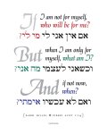
ifiam_originalMost recently, I happened to see a few orders in a row for one of my earliest pieces, a setting of Rabbi Hillel’s famous aphorism in Pirkei Avot:

If I am not for myself, who will be for me?
But when I am only for myself, what am I?
And if not now, when?
(Pirkei Avot 1:14)

Fun fact: I first created this piece in a handmade version as a gift for my dad back in 1994. The typeset version was designed some years afterward, but no later than 2001.

In other words, it’s gotten a little dated… especially as typographic decorative art has really come into fashion over the last few years (everywhere from Etsy to CB2 to Target) with a more contemporary aesthetic.

Looking at it with fresh eyes, I decided that it was really time for an update. So I created a new version.

This slideshow requires JavaScript.

While I was at it, I posted a downloadable version so that buyers can print their own copy (at any desired size) locally, rather than have me ship them an unframed print. One download includes PDFs of all three pieces.

Carpe diem!

Designs for the Blue Hill Troupe’s 2014 Ruddigore

As many of you know, for the last two years I have been a Backstage member of the Blue Hill Troupe, Ltd., the only musical theater group in New York City to donate its net proceeds to charity.

Last year, I was privileged to serve as the Troupe’s Marketing Graphics coordinator, as well as the lead Program Designer. Since I’m still catching the blog up on all my projects from Spring 2014, here’s a look at the materials I produced for their April 2014 show, Gilbert & Sullivan’s Ruddigore.

[portraits]

The original Act II sketch.

Historically, the Troupe has often based show graphics on the concept sketches of the set design. For this Ruddigore, I was totally enamored of the richly toned watercolor artwork that the set designer (noted NYC architect Byron Bell) produced for the iconic Act II “ancestor portraits” set, so I was keen to figure out a way to work with that.

As a background for text, however, this selection presented some challenges: it’s not only very busy, it’s also highly discontinuous, the dark background being heavily cut by the white grid of the portrait frames. My techniques for adapting to this background included:

  • deepening the color values as much as I could without losing contrast or detail;
  • using white (or “reversed out”) text against the primarily dark background;
  • setting most of the text in the very simple and legible Myriad Pro (except for the ornate title, set in Blackadder) to help counteract the heavy texture of the background;
  • adding a subtle gray outline stroke to the letterforms to create a boundary against the lighter areas of the art;
  • strategically adjusting the composition (via cropping, sizing, and positioning) to create as much neutral space for the text as possible while preserving concrete elements of the stage set (table, candelabra, freestanding portrait) as a visible frame.

The first piece we produced was a 4×9″ postcard. Over the course of the year, I adapted this layout into several more single-sided pieces such as display ads, our Facebook cover page, other web graphics, and an 11×17″ window poster for our Brooklyn workspace. Later, there was a quad-fold 8.5×14″ brochure that included a ticket order form.

This slideshow requires JavaScript.

Finally, I also got to serve as lead designer on the program booklet, which is a glossy 136-page perfect-bound extravaganza with a full-color cover. For the cover here, we turned to another of Byron’s sketches: the wrought-iron gates of the tiny Cornish fishing village of Rederring. (This elaborate set piece was incorporated into the overture, then dramatically flown out at the top of Act I.)

The program cover.

The program cover.

Since this was a simple line-art sketch, I placed it on a parchment background, then used a striking red shade to highlight the “ruddy gore” of the title text. This treatment produced a thoroughly different look that still worked thematically for our melodramatic period piece. For consistency, I kept the same title logotype as on the promotional materials, but I wanted the rest of the program to evoke the old-fashioned typography of a vintage newspaper, so I used Bodoni for both body and display text throughout.

Note that, having moved away from NYC to Indiana immediately after the show closed in April, I’ll be an Associate member of the Troupe for the coming year… though I’m still on call for the occasional design project! Their 2014-15 season includes Lucky Stiff this November (for which rehearsals are now in progress) and Gilbert & Sullivan’s Patience next April. Break legs, all!

My new Etsy shop: Schultz Yakovetz Judaica

Recently, I took the plunge and did something I’ve been thinking about for ages: open a storefront for my Judaica artwork on Etsy.

Check it out! Visit now: www.etsy.com/shop/SchultzYakovetz

SYJbanner

For anyone not familiar with Etsy:

Etsy is a marketplace for crafters, artists, and collectors to sell their handmade creations, vintage goods, and crafting supplies. Etsy celebrates individual creativity in design and craftsmanship by connecting unique people, stories, and items in a playful and meaningful way. —from the site

So far, my storefront features a subset of the art prints available on my main Judaica site. Here’s a quick sample:

In the coming weeks, look out for:

  • Downloadable hi-res digital files (so you can print a piece for yourself and save on shipping!)
  • Photos of the framed finished pieces (so you can see how awesome they’ll look on your wall)
  • Holiday cards (remember, Rosh Hashanah 5776 starts Wednesday, September 24)
  • My top ketubah designs available to customize
  • New art pieces exclusive to Etsy

Happy shopping… and shabbat shalom!

Portfolio updates

One of the things I’ve been working on this last month, in addition to some new freelance projects, is updating my online portfolio.

That last page includes links to more updated portfolio pages of ketubahs, invitations, and additional wedding materials such as programs and bentscher covers.

Here’s a quick sample:

A lot of my design work last winter revolved around (no surprise to any designers reading!) my own wedding, which took place in February. I kept the invitations very simple and traditional, but since we were getting married on Valentine’s Day, that gave me a very clear design direction.

I got lots of compliments on the elegance of this design, especially when paired with red-foil-lined white A2 envelopes from JAM Paper in NYC. (Boy, do I miss that place.)

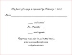
But the great part is that they were also super cheap to produce, since I had them color-laserprinted onto plain white card stock at FedEx Office and cut into quarters. The RSVP return card was a postcard (printed double-sided but black only), which also saved on return envelopes. The whole ensemble, with envelopes, ended up costing only about a dollar per invitation — not counting the postage (for which we ordered the supremely cool Miles Davis commemorative stamps, appropriate to our jazz-club venue).

Tomorrow’s post will be a detailed case study of another essential design piece in a Jewish wedding — our ketubah. Stay tuned!

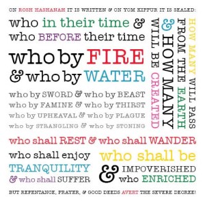
Because this is still a design blog: Who By Fire

I’ve occasionally tried my hand at creating holiday cards, but never anything particularly inspired, somehow.

Then during Rosh Hashanah services this year, I managed to remember that the Thing I Do is play around with text, especially Biblical or liturgical text… and there’s no shortage of great material in the High Holiday liturgy. Which excited me, even if it results in a bit of a departure from your basic apples-and-honey “good and sweet year” greeting card motif.

So here’s the first one:

On Rosh Hashanah it is written, and on Yom Kippur it is sealed...

This famous liturgical passage is from the central U’netaneh Tokef section of the Rosh Hashanah Musaf prayer service. Click to enlarge.

I have a few more passages still in mind to work up. Next year I intend to actually get some of them printed up in time to use for the holiday… so I made sure to use up the last few mundane ones in my stash this year.

Edited to add (2015): Buy it on Zazzle!

Ketivah v’chatimah tovah: May you all be written and sealed for a good year.

New ketubah design: Flames

Friends in the Philadelphia area invited me several months ago to create the ketubah for their wedding, taking place today. I’m sadly missing the wedding itself, as I am away on vacation with my mom (this post is appearing through the magic of pre-scheduled posting; thanks, WordPress!), but I was excited to be able to play a role in their special day nevertheless.

Today is Lag Ba’Omer, the 33rd day of the seven-week “omer” period between the Jewish holidays of Passover and Shavuot. Sefirat ha-Omer is a period of semi-mourning in which a variety of joyful activities are customarily proscribed, including listening to live music, buying new clothes, cutting one’s hair (!), and getting married. However, the 33rd day of this period is observed as a minor festival, with a temporary lifting of those prohibitions… making it a very popular date for Jewish weddings, particularly when it falls out, as this year, on a Sunday.

Weddings aside, Lag Ba’Omer is typically associated with outdoor celebrations, and especially with bonfires. So when it came time to ponder artistic themes for this ketubah, I suggested fire, and the idea immediately touched off, well, sparks.

ketubah

A bonfire-themed ketubah for a Lag Ba’Omer wedding.

In this all-text design, the two primary flames are the ketubah text itself: standard Orthodox Aramaic incorporating the Lieberman clause, and an accompanying English rendition (not, mind you, a translation; the actual standard legal text is highly technical and nothing so poetic). The additional decorative “sparks” rising up around the flames are verses from Song of Songs (2:10, 2:14, and 6:3). Producing this piece digitally meant that I could apply a gradient color scheme to enhance the flame effect—something we could never have achieved with hand-lettering.

The finished piece is 16×20. It was output by my go-to colleague for digital imaging, Jim Paradis of Baldwin Hill Art & Framing in Natick, MA, as an archival-quality giclée art print on smooth art paper. The entire design and approval process took just over five weeks, and the final print was shipped overnight with a week to go before the wedding.

Mazal tov, Lawrence and Ellyn!