Purim is coming! Have some music!

Mishenichnas Adar, marbin b’simcha.
“When the month of Adar enters, we increase in joy.”
— Gemara (Taanit 29b)

Quick primer: Today is the first day of the Hebrew month of Adar. In fact, it’s the first day of the second month of Adar, since this year is a leap year — which, in the Jewish lunar calendar, means not just adding an extra day but a whole extra month (known in those years as Adar I).

The point is, it’s less than two weeks until the festival of Purim, when we celebrate the Persian Jews’ deliverance from persecution in the fourth century BCE, as detailed in the Book of Esther.

So I wanted to share some little-known Purim music collections… the perfect soundtrack for your hamantashen baking.

First, The Ramaz School in NYC (where I was the webmaster from 2011-2014) produced an album of Purim songs in 2012, featuring both students and faculty. The whole collection can be played or downloaded for free at web.ramaz.org/purim/index.html. Brush up on standards like Mishenichnas Adar and Shoshanat Yaakov, and enjoy some new and original compositions. Yasher koach to Ramaz for being leaders in Jewish education and music education, as well as service to the greater community.

ramaz-purim_photo-bar_1000px

Second, I would be remiss not to point out the two Purim-themed operas by David Bass, The Coronation of Esther (2001) and its sequel Springtime for Haman (2004). The North Cambridge [MA] Family Opera Company hosts recordings of both operas:

Chodesh tov and shabbat shalom!

Chanukah song sheet (free downloadable)

Chanukah_FBbanner
In honor of Chanukah starting tonight, I wanted to share the link to my free downloadable Chanukah song sheet (available on the “Ritual Materials” page of my Judaica site).

Everyone loves to sing at Chanukah parties (don’t they??), but no one can remember the words to anything more than one verse of Ma’oz Tzur. Now you can! This version, produced in 2011, includes all the Chanukah candle-lighting blessings (with transliterated Hebrew) PLUS the lyrics to 12 favorite Chanukah tunes, all on one easily-photocopied 8.5×11″ sheet (double-sided).

… Oh, and lest I forget, there’s also my ever-expanding Chanukah YouTube playlist.

Chag sameach, all. Now excuse me while I go start peeling potatoes!

New art piece: If I Am Not For Myself, Who Will Be For Me? (2015 Edition)

I’m pleased to report that my Etsy shop, Schultz Yakovetz Judaica, is doing well. Not “quit my day job” well or anything, but I’ve literally sold more art in the last six months than I had in all the previous years—total—of selling via my website. (For that matter, it seems to have raised the profile of my own site, since a few of those recent sales came directly through my site rather than the Etsy shop. And even that was a statistically significant uptick.)

ifiam_originalMost recently, I happened to see a few orders in a row for one of my earliest pieces, a setting of Rabbi Hillel’s famous aphorism in Pirkei Avot:

If I am not for myself, who will be for me?
But when I am only for myself, what am I?
And if not now, when?
(Pirkei Avot 1:14)

Fun fact: I first created this piece in a handmade version as a gift for my dad back in 1994. The typeset version was designed some years afterward, but no later than 2001.

In other words, it’s gotten a little dated… especially as typographic decorative art has really come into fashion over the last few years (everywhere from Etsy to CB2 to Target) with a more contemporary aesthetic.

Looking at it with fresh eyes, I decided that it was really time for an update. So I created a new version.

This slideshow requires JavaScript.

While I was at it, I posted a downloadable version so that buyers can print their own copy (at any desired size) locally, rather than have me ship them an unframed print. One download includes PDFs of all three pieces.

Carpe diem!

New for 2015: I’m in a book!

Last month, I received an email inquiry from a photographer named Susan Ressler, formerly of Indiana (she is Professor Emerita of Visual and Performing Arts at Purdue University) and now of New Mexico. elements

Susan was preparing to self-publish a book of her fine art photography from a recent trip to Israel, organized (as it happened) into sections based on the elements: Air, Fire, Water, and Earth. She had come across my 2007 piece Elements: The Holy Cities and wanted to include it in the introduction to her book, as a way of setting the stage!

Her completed book, Understanding Israel (subtitle: “Jaffa is More than Oranges”), is now live on a print-on-demand site called Blurb. It’s available in two trim sizes: 8×10 ($45.99) or the more luxurious 11×13 ($99.95), both in a dramatic landscape format. If you click on the title above, you can browse through the entire book. For the curious, my contribution is on page 10 :-) but the rest is well worth a look.

Below is the official Blurb “badge” for the book:

Understanding Israel (8x10
Understanding …
Jaffa is More than…
By Susan Rebecca Ressler
Photo book

 
(And also, since apparently this is my first post in the new year: Happy 2015!)

New art piece: To Everything There Is A Season

Today is Rosh Chodesh Elul (which means only one month to Rosh Hashanah). In honor of the new Hebrew month, I’m debuting a new art piece!

As a young teenager, I was deeply into the music of the 1960s, and I still remember getting goosebumps the first time I heard the Byrds’ 1965 hit recording of Pete Seeger’s “Turn! Turn! Turn! (To Everything There Is a Season)”.

I knew it was taken from a passage in the Book of Ecclesiastes, though I didn’t know much more about it than that. Much later, I experienced Ecclesiastes as the Hebrew scroll of Kohelet, which is traditionally ascribed (like the book of Proverbs, or Mishlei ) to King Solomon, and in many Jewish communities is read aloud in its entirety at Shabbat synagogue services during the fall holiday of Sukkot.

A couple of years ago, at a friend’s house, I saw a framed calligraphy piece based on this same passage, Ecclesiastes 3:1-8. That inspired me to want to do a version of my own.

The primary motif I had in mind was to set the English phrases as a sine wave or a helix, winding around the structure of the Hebrew. The above-and-below undulation would convey the duality in each of the pairings. Each Hebrew phrase is color-matched with its English equivalent to create a visual connection between the two levels. I chose to invert the Hebrew in these layers so that the text flow of both languages could run in the same clockwise direction — another way to echo the “wheel of time” feeling of the passage.

Ultimately, I arranged the text in a mandala of four nesting circles. The outermost circle is formed from the opening verse, which provides the conceptual frame for the whole passage. The second layer contains eight pairings, the third layer five pairings, and the last pairing forms the final circle with “peace” at its center… driving the whole composition, like Pete Seeger’s adaptation, toward an optimistic goal at its core.

One note on the translation: The well-known King James Version translates the second half of verse 1 as “and a time to every purpose under the heaven”. The Hebrew word used there, however, is cheifetz, which in other contexts is always rendered as “please” or “enjoy”. (Compare to Psalm 115:3, V’elokeinu ba-shamayim; kol asher chafetz asah. “Our God is in the heavens; He does whatever He pleases.”) Thus, some English translations give it as “to every delight” or “pleasure under the heavens”. Many other translations simply say “event”, “matter” or “activity”. I wanted to find a word that conveyed the semantic direction of “pleasing” without categorizing killing and destroying as “delights”, and settled on “to every impulse under the heavens.” I also tried to preserve the distinctions in the Hebrew between “a time to [verb]” and “a time of [noun]”.

This slideshow requires JavaScript.

I created Version I using the classical Roman-style font Trajan for all of the English text, for a smooth and formal look. However, then I wanted to try to bring out the (literal) texture of the passage with a little more contrast, so I experimented with applying a calligraphic italic hand (a font called Aquiline) to accent the changing keywords in each English phrase. This resulted in Version II.

Both pieces are now available in my Etsy shop, along with a hi-res PDF download that includes both versions in case you prefer to print your own.

Which version do you think works best? Let me know in comments.

Chodesh tov!

How I make art, Part 1: Resources for Hebrew text

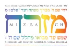
This week, I’ve been working on a new Judaica art piece, which I look forward to releasing next week! But before I get there, I wanted to talk about my process for making art out of text in Hebrew and English.

It starts where everything starts — with an idea. Some words catch my eye and fire my imagination. Most often, it’s either a Biblical text or a passage from the siddur, the Jewish prayerbook. (Frequently, it’s both, as Biblical quotations make up a significant portion of the wording of our formal prayers.) Occasionally, it’s a quote from the Talmud, about which more below.

But how do I get going from there? First, I go to the Internet!

… Why not start on my own bookshelf? I own numerous Bibles in both Hebrew and English (one of my favorite translations, incidentally, is Everett Fox‘s Five Books of Moses, a.k.a. the Schocken Bible). But here’s Confession #1: I’m not so strong on chapter and verse. So I start by doing a Google search for the English phrasing, in order to locate the verse I’m thinking of.

From there, I look up the Hebrew. Mechon Mamre maintains an excellent complete Hebrew-English online Bible, featuring the well-reputed standard English translation by the Jewish Publication Society (JPS). I will usually go here to copy and paste entire passages. Note, though, that they provide “pointed” text, with the nekudot: vowel marks and other punctuation that are positioned around the actual letters (or, in the words of psycholinguist Dorit Ravid, “diacritics ancillary to consonantal graphemes”).* This notation is essential for study purposes, but I generally go on to strip out the nikkud, because I prefer to use just the un-pointed letters in my artwork.

* However, the Ancillary Diacritics is totally my new band name.

My next stop is, perhaps surprisingly, a Christian Bible site, one called Blue Letter Bible. While I tend to steer clear of Christian-sponsored sites, this one offers a spectacular feature that I haven’t found elsewhere: a word-by-word breakdown of the original Hebrew, as well as the Greek from the Septuagint, for every single verse of the Old Testament.

[Blue Letter Bible tools screenshot]

The language tools at Blue Letter Bible. Careful observers will pick up a clue as to the forthcoming new art piece.

My own Hebrew skills are normally sufficient to match up the corresponding words from an English translation; in fact, this is an important element in my artwork, where I frequently color-code specific words or phrases to create explicit visual connections between the texts. But sometimes I feel like the English in front of me doesn’t quite capture the nuance I’m getting from the Hebrew. When I want to refine the translation I’m including in the piece, it can be amazingly helpful to see a range of English translations side-by-side, or to click through to the Strong’s Concordance entry to see how the same word has been interpreted in different contexts. Plus, they provide a box to toggle the “vowel points” (the aforementioned nekudot) on or off, so I can copy a whole verse with just the unpointed letters. Priceless.

Now, what if I am researching a Talmud quotation? Certain sections are easy to find in translation, like the tractate of Avot, better known as Pirkei Avot, or in English as “The Ethics of the Fathers”, which is reproduced in its entirety in most traditional prayerbooks. Often, however, I will see delightful quotes attributed solely to “The Talmud”… which may be technically accurate, but not very helpful! Google is my friend here again. Sometimes it turns out that quotes attributed to “The Talmud” (such as this one, identified here) actually come from Midrash Rabbah, which is a fantastic (and often fantastical) body of interpretive commentaries, but not part of the Talmud.

Once I can get a specific citation, I can look up the Hebrew in Mechon Mamre’s online Talmud Bavli (the “Babylonian” Talmud that is the version commonly studied). Some chapters are available in English at Halakhah.com, at Sacred Texts, and at the Jewish Virtual Library. If I’m looking for Midrash Rabbah, there’s a complete online Hebrew edition at Tsel Harim.

For Hebrew text from the prayerbook, I am more likely to turn to my actual bookshelf. However, there are several useful Web resources, such as the Online Siddur, the Open Siddur Project, and the Free Siddur Project.

There are many more great collections of links and scholarly resources at sites like the following:

One last technical note: I create my artwork in Adobe InDesign. Now, if I copy a line of Hebrew text from a web page, it is almost certainly in Unicode, which the browser knows to render right-to-left… but InDesign pastes in the character sequence from left to right. Because here’s Confession #2: I don’t actually use it to handle Hebrew properly. Now that I’ve upgraded to Creative Suite 6, its World-Ready Composer gives some built-in support for right-to-left sequencing at either the paragraph or character level… but the way it behaves still isn’t very intuitive for me, and I get frustrated after just a few minutes. It’s actually easier for me to cheat with an intermediate step: reversing the string in order to make it come out correctly. On a few old projects, I did this by hand (!), but these days I turn once again to the magic of the Internet, where there are handy web-based utilities for this purpose.

  • Reverse a String Online was my longtime quick-and-dirty favorite for single lines.
  • Text Mechanic’s “Reverse Text Generator” offers an additional option called “Flip Text”, which reverses each line (or technically paragraph), but keeps the lines themselves in the correct top-to-bottom sequence — just what I need for longer sections.

Once I’ve got all my text in place, in Hebrew and English, that’s my raw material. Only then can I start to play with it to create art. But that’s a totally separate process that I will try to address in another, less technical — and probably shorter! — post.

Shabbat shalom!

My new Etsy shop: Schultz Yakovetz Judaica

Recently, I took the plunge and did something I’ve been thinking about for ages: open a storefront for my Judaica artwork on Etsy.

Check it out! Visit now: www.etsy.com/shop/SchultzYakovetz

SYJbanner

For anyone not familiar with Etsy:

Etsy is a marketplace for crafters, artists, and collectors to sell their handmade creations, vintage goods, and crafting supplies. Etsy celebrates individual creativity in design and craftsmanship by connecting unique people, stories, and items in a playful and meaningful way. —from the site

So far, my storefront features a subset of the art prints available on my main Judaica site. Here’s a quick sample:

In the coming weeks, look out for:

  • Downloadable hi-res digital files (so you can print a piece for yourself and save on shipping!)
  • Photos of the framed finished pieces (so you can see how awesome they’ll look on your wall)
  • Holiday cards (remember, Rosh Hashanah 5776 starts Wednesday, September 24)
  • My top ketubah designs available to customize
  • New art pieces exclusive to Etsy

Happy shopping… and shabbat shalom!

Space ketubahs!

Today is Tu B’Av (the 15th day of the Hebrew month of Av, a date sometimes known as the “Jewish Valentine’s Day”)… and our 6-month wedding anniversary is coming up in just a couple days. So in honor of those two romantic observances, let me share with you one of my favorite wedding-related design projects.

In planning a Jewish (or, in our case, Jewish-style interfaith) wedding, one of the fun things to work on is the ketubah, or marriage contract. This traditional document is signed — usually by two witnesses, the couple, and the officiant — on the wedding day, often in a separate ritual before the actual ceremony, though our rabbi had us incorporate the signing right into the ceremony.

Now, anyone who knows Mr. Y at all knows that he is a huge Star Wars geek (you should see the collection in our upstairs hallway). But what is only slightly less well known is that he is also a longtime real-life astronomy buff, who worked for many years in the local community planetarium (WHICH WE TOTALLY HAVE, FYI, and which he has yet to take me to visit, but I digress).

So when I started thinking about what would make the most awesome motif for our ketubah, the answer was SPACE.

When I emailed a first set of drafts to Mr. Y, I couldn’t resist including this version, which I made on a lark (click to enlarge):

DEATH-STAR-KETUBAH

While this had precisely the desired effect (“That’s FANTASTIC! … I totally cracked up when I saw the Star Wars version. Freaking great! You are awesome.”), we concurred that it probably wasn’t seriously the best way to go, no matter how perfectly it would complement the set of movie posters in our living room.

But I’d also created a draft that we would eventually refine into this:

SPACE-KETUBAH

After editing together the final art assembly, I spent some time looking for just the right Biblical text to draw in the cosmic theme, and ended up with Psalm 19: “The heavens tell the glory of God… In them He has set a tent for the sun, which emerges like a bridegroom from his chuppah, like a hero rejoicing to run his course” (19:1, 4-5). How’s that for relevance? This passage is used as a decorative border all around the piece, mostly as white text, with corresponding key words accented in yellow in both the English and the Hebrew.

Note that since Mr. Y is not Jewish, this text is not the traditional ketubah text, but basically a completely unrelated text in English and modern Hebrew, one that I had received previously for a custom ketubah project. We liked the wording a lot, but just as importantly, I also trusted the Hebrew translation to be not only accurate, but idiomatically correct (this is often not the case with Hebrew translations of custom texts; I could do a whole post of horror stories on that topic).

And, since everyone asks, the final version was signed in silver Sharpie. (Just one more of their million uses. :-) It’s now happily framed in our front hallway:

SPACE-KETUBAH-framed

Portfolio updates

One of the things I’ve been working on this last month, in addition to some new freelance projects, is updating my online portfolio.

That last page includes links to more updated portfolio pages of ketubahs, invitations, and additional wedding materials such as programs and bentscher covers.

Here’s a quick sample:

A lot of my design work last winter revolved around (no surprise to any designers reading!) my own wedding, which took place in February. I kept the invitations very simple and traditional, but since we were getting married on Valentine’s Day, that gave me a very clear design direction.

I got lots of compliments on the elegance of this design, especially when paired with red-foil-lined white A2 envelopes from JAM Paper in NYC. (Boy, do I miss that place.)

But the great part is that they were also super cheap to produce, since I had them color-laserprinted onto plain white card stock at FedEx Office and cut into quarters. The RSVP return card was a postcard (printed double-sided but black only), which also saved on return envelopes. The whole ensemble, with envelopes, ended up costing only about a dollar per invitation — not counting the postage (for which we ordered the supremely cool Miles Davis commemorative stamps, appropriate to our jazz-club venue).

Tomorrow’s post will be a detailed case study of another essential design piece in a Jewish wedding — our ketubah. Stay tuned!

Happy (early) Thanksgivukkah: order your cards now!

Have you ordered your Thanksgivukkah cards yet?? This is going to be a spoiler for anyone getting holiday cards from me this year, but I’m putting it out here so you can still get your own if you want!

Front of card

Front of card

Inside of card

Inside of card

I’m placing this order tomorrow (Thursday) morning for delivery by Monday, Nov. 18. If you want some, order here and I’ll ship yours to you FREE for arrival by Friday, Nov. 22.

Size: A2 (4.25″ x 5.5″ folded). Includes colored envelopes.

Pricing:
10 for $15.00 ($1.50 apiece)
24 for $30.00 ($1.25 apiece)
50 for $50.00 ($1.00 apiece)
100 for $75.00 ($0.75 apiece)
FREE SHIPPING!

Click here to order now! You can also email me with your desired quantity and I’ll contact you for payment details.